
Rebuilding a Multi-Carrier Insurance Platform
Redesigning small business insurance quoting across dozens of carrier rulesets.
The Situation
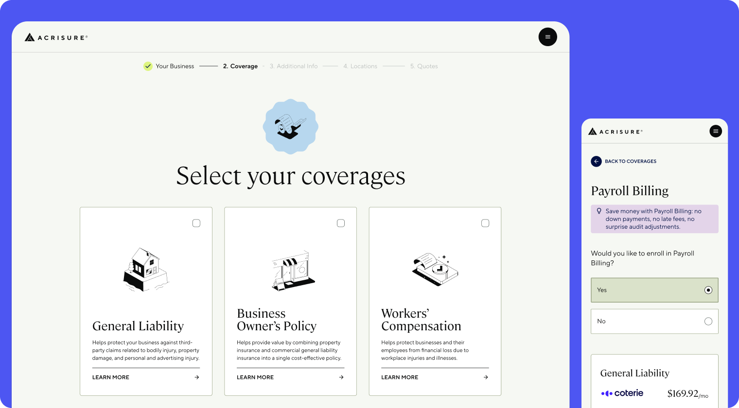
Small businesses use this platform to quote and bind insurance across six product lines. It has to support fully digital, hybrid, and agent-assisted journeys at once. More than half of the traffic is mobile web, with no native app.
After an acquisition, the product had to move onto a new tech stack as a temporary fix. It shipped rough: industry codes, billing, and autofill weren't working reliably, and it struggled to support the digital, hybrid, and agent-assisted journeys the business needed. Over a few months I rebuilt the experience, alongside engineering rebuilding the backend, to work across dozens of carrier rulesets without pushing that complexity onto the customer.
The Constraint
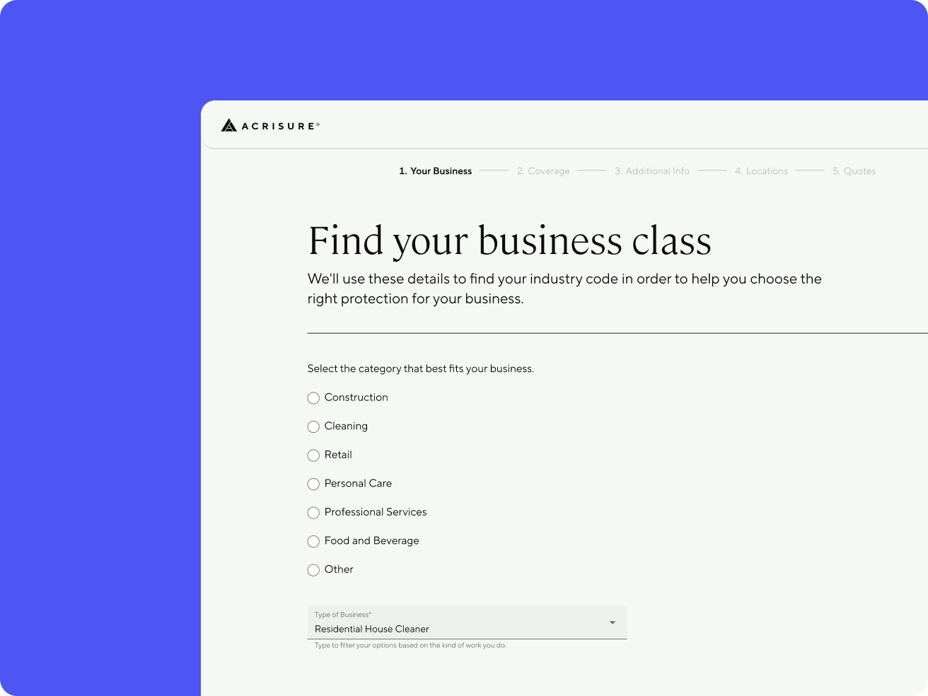
Every product line depends on classifying a customer's industry correctly to determine eligibility and price, and there are thousands of possible codes with naming inconsistent enough to get strange (cleaning services alone split across half a dozen adjacent categories). Single-carrier competitors can offer a clean, curated list because they underwrite end to end.
This platform works across many carriers at once, so that shortcut wasn't available. Consolidating the raw data into something friendlier would have taken engineering investment that was never prioritized. The design system was built for personal insurance, so I scaled it and added the components commercial needed.
Industry Classification
Industry classification was the screen causing the most confusion after the September 2024 launch. High time-on-screen showed people struggling to find their category, made worse by the constraint above: thousands of inconsistent, carrier-specific codes with no budget to simplify them.
The obvious answer was AI. Let a customer describe their business in plain language and have a model return the closest matches, with a manual fallback for low-confidence cases. We built it. Before it ever reached a customer, we tested it internally against real business data, and the match accuracy didn't clear the bar we needed.
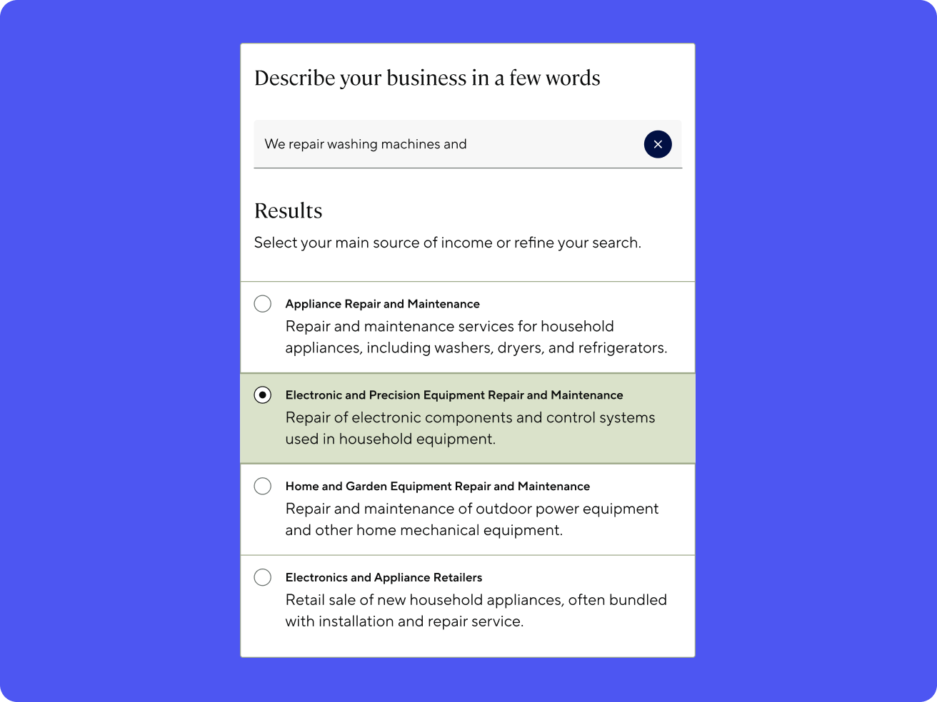
We didn't ship it. In insurance, getting someone's industry wrong isn't cosmetic: it can misprice or misqualify a customer, and my team automatically weighs that risk on anything customer-facing. Walking away from the AI feature was the obvious call, even without a precise technical explanation for why the model underperformed.
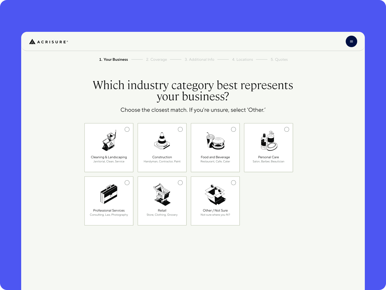
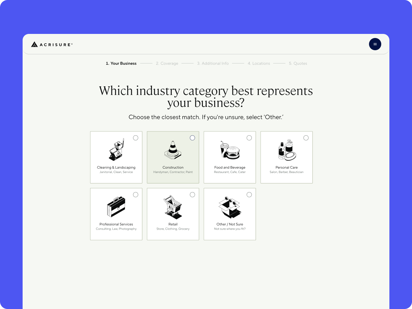
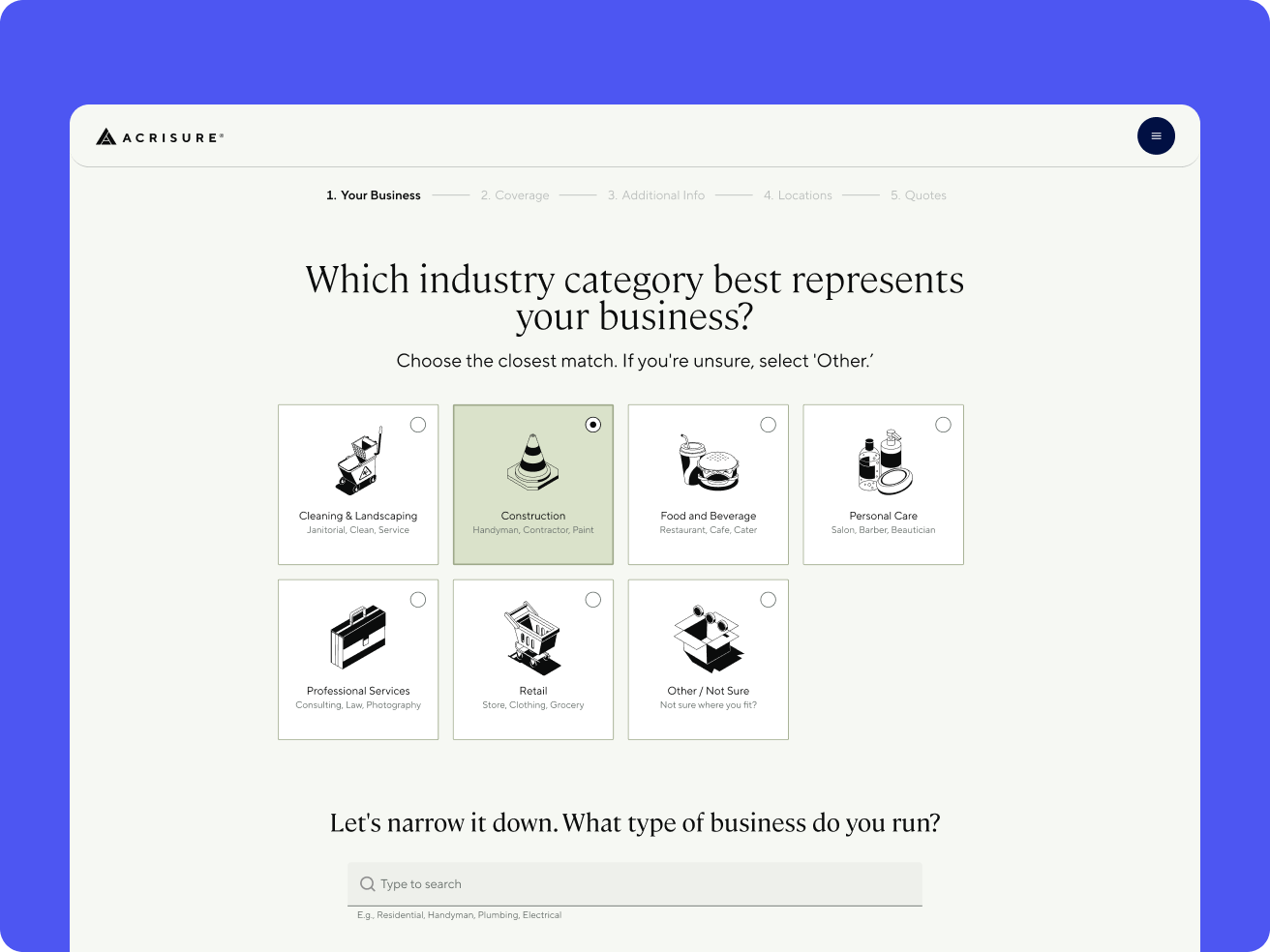
What shipped instead was a visual card grid: broad categories represented with icons and plain-language examples, so a customer could recognize their business instead of parsing formal category names. Selecting a category scopes both the visible list and the search field below it, so a short, ambiguous term like "cleaning" doesn't return unrelated matches across the full 2,000-code set. Anyone unsure can pick "Other" and search the full set.
Sequencing Carrier Questions
Every carrier asks its own underwriting questions, and they arrive from engineering as raw API fields like residential units or percentage of sales from alcohol. The goal was getting customers to a quote fast, but every carrier needs different questions answered before it can price, and customers don't need to know which. For every field, my first question was whether it had to come before the quote or could wait until after. The ones that gate the quote became plain-language questions a business owner could answer, placed up front. Everything else waits until after the customer picks a carrier.
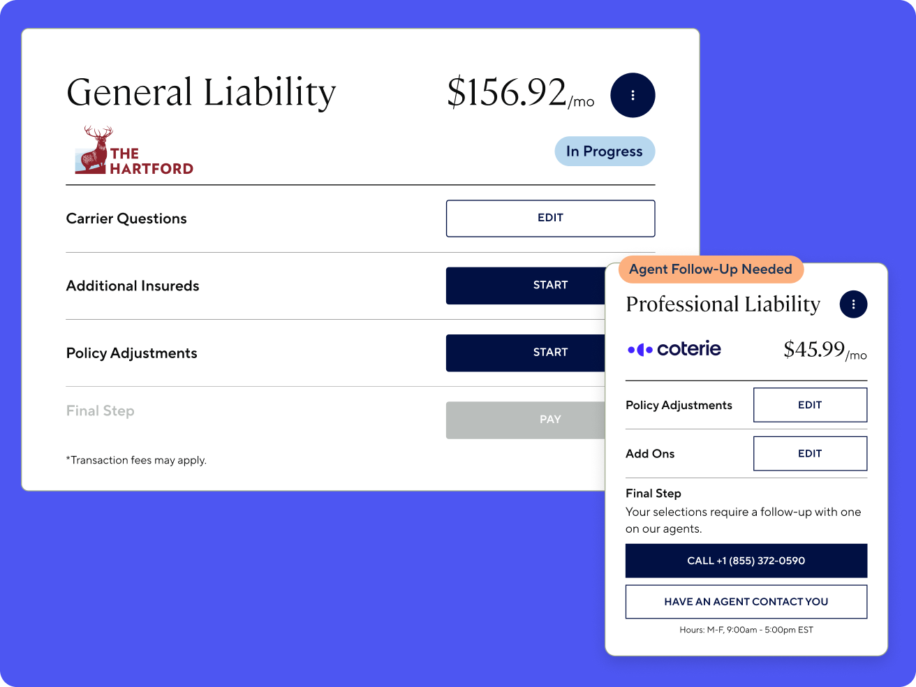
Those later questions live in the Coverage Hub, which I designed. Carriers also finish binding at very different speeds (one confirms almost instantly, another needs an e-signature and can take days), so each coverage gets its own thread and the customer can see where every one stands (in progress, complete, needs signature). The flow supports digital, hybrid, and agent-assisted journeys, so customers can finish digitally where possible and bring their context with them if they need an agent.
This is one of the best user experiences we have seen in the customer-facing realm.
The Hartford, Carrier PartnerResults
- Over 30% year-over-year increase in average conversion to bind
- 5% more users went on to payment after we removed a confirmation modal that added hesitation at the last step.
- +3.7% conversion lift from the industry classification redesign
- Reduced reliance on phone-only binding
Reflection
Designing for scale turned out to be a different problem than designing to prove an idea works. The complexity of a multi-carrier platform never went away, so most of the work was deciding when the customer had to meet it: recognizing an industry instead of parsing a code, answering only what the quote needed, and saving the rest until a carrier was chosen.